

BUILD AND MARKET YOUR SHOPIFY STORE
We help e-commerce brands maximise growth opportunities


Why Your Shopify Store Design Matters and How to Improve It
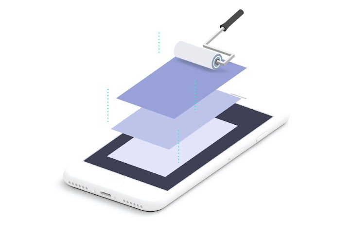
Your Shopify store's design is not decoration. It decides whether visitors trust you, how quickly they find the right product, and whether they reach checkout or leave for a competitor. The good news is that the changes that matter most are rarely dramatic: clearer navigation, stronger product pages, a faster phone experience and a theme built for today's Shopify.
This guide explains why design matters for Shopify stores specifically, what to fix first, and when a redesign is worth it. We are a Shopify agency with our own Shopify designers, and the advice below comes from the stores we audit and rebuild.
Quick Answer
Store design matters because it shapes first impressions, trust and conversion rate. People judge a page's visual appeal in a fraction of a second, and at a typical 1.7% conversion rate, lifting conversion by a tenth of a percentage point adds almost 6% to revenue at the same traffic. Start with the structural basics: a modern Online Store 2.0 theme, a phone first layout, clear navigation, strong product pages and fast loading. Redesign fully only when your theme is outdated or your brand has changed.
Key Takeaways
- Research shows people rate a web page's visual appeal within 50 milliseconds, before they read anything.
- Across 265 stores we have audited, the median conversion rate is 1.7%; at that baseline, a tenth of a percentage point more conversion lifts revenue by 5.88%.
- 196 of those 265 stores were on legacy themes that predate Online Store 2.0, which limits what merchants can change without code.
- The biggest wins are structural: navigation, product pages, calls to action and speed, rather than colours and fonts.
- Design for phones first, with tap targets of at least 24 by 24 CSS pixels to meet WCAG 2.2 AA, and 44 by 44 for the stricter AAA level.
- Iterate when your theme is sound; rebuild when it predates Online Store 2.0 or no longer reflects your brand.
Table of Contents
- First Impressions Happen Fast
- How Design Affects Conversion
- Design for Phones First
- Start with the Right Theme
- Core Design Principles
- Product Pages That Sell
- Navigation and Search
- Speed Is a Design Decision
- Common Shopify Design Mistakes
- When to Redesign and When to Iterate
- Why Matters Perspective
- Frequently Asked Questions
- Final Thoughts
- Related Articles
First Impressions Happen Fast
A widely cited study from Carleton University, published in Behaviour and Information Technology in 2006, showed people web pages for just 50 milliseconds and again for 500 milliseconds. Their ratings of visual appeal were closely matched, which suggests visitors form a view of how a page looks in a twentieth of a second, long before they read a word.
For a store, that first impression carries straight into trust. A clean layout, consistent branding, sharp product photography and visible reassurance, such as reviews, delivery information and a clear returns policy, tell visitors your business is organised. A cluttered or dated store suggests the opposite, however good your products are.
How Design Affects Conversion
Every step between landing and checkout is a design decision: how products are shown, how easy the add to cart button is to find, and how much friction sits in between. Small improvements compound. Across 265 stores we have audited, the median conversion rate is 1.7%. At that baseline, lifting conversion by a tenth of a percentage point, from 1.7% to 1.8%, raises revenue by 5.88% at the same traffic and order value, about £59,000 a year on a £1 million store.
That is why we treat design as a commercial tool rather than a matter of taste. Our guide to why your Shopify conversion rate matters explains how to measure yours, and our guide to increasing Shopify conversions covers the changes that move it.
Design for Phones First
For most stores we work with, phones bring the majority of visits, so design the phone experience first and adapt it upwards. Check your own split in Shopify's sessions by device report or in Google Analytics 4, and see our guide to mobile first Shopify design for the latest market figures.
On a phone, the priorities are a visible buy button, simple menus, readable text without zooming, and buttons large enough to tap accurately. The WCAG 2.2 accessibility standard sets a minimum target size of 24 by 24 CSS pixels at level AA, and 44 by 44 at the stricter AAA level. Apple recommends at least 44 by 44 points. A sticky add to cart bar keeps the purchase button in reach as shoppers scroll long product pages.
Start with the Right Theme
Your theme sets the ceiling for everything else. Of the 265 stores we have audited, 196 were on legacy themes that predate Online Store 2.0, the architecture that lets you add and rearrange sections on any page without code. When we upgrade stores to Online Store 2.0, mobile PageSpeed scores rise by an average of 23 points. Our guide to Shopify Online Store 2.0 explains how to check which kind you have.
The Shopify Theme Store has around two dozen free themes. Horizon is Shopify's current generation of free themes, built on theme blocks that can sit inside other blocks, while Dawn remains the most widely used and best documented. AI block generation, once a reason to pick Horizon, has worked on every Theme Store theme since December 2025. Most premium themes cost $250 to $500 as a one off purchase, about £185 to £370, and you can install and customise one before paying, only paying when you publish it. Our guide to choosing the right Shopify theme covers what to look for.
Core Design Principles
Effective ecommerce design follows the same principles whatever you sell:
- Simplicity: every element should help a shopper find a product, judge it or buy it. Anything else competes for attention.
- Consistency: buttons, type, colours and spacing should behave the same on every page, which builds familiarity and trust.
- White space: room around products, headings and buttons makes them easier to notice, not harder.
- Contrast: the add to cart button should be the most prominent element on a product page, and body text needs a contrast ratio of at least 4.5 to 1 against its background to meet WCAG level AA.
- Legible type: one or two font families, with size and weight doing the work of hierarchy.
Product Pages That Sell
Product pages are where buying decisions happen, so they deserve more design attention than any other template. A strong product page shows several high quality images, including the product in use; has a clear title and a price that is easy to find; answers the questions buyers ask before purchasing, from materials to sizing and care; keeps the add to cart button visible without scrolling; and shows reviews, delivery times and returns information near the buy button. Our guide to Shopify product page design goes into each element.
Navigation and Search
If shoppers cannot find what they want within a few seconds, they leave. Keep the main menu short, use labels that match how customers describe your products, and add filters on collection pages for the attributes people shop by, such as size, colour or price. Make search easy to find, with predictive results, and keep delivery, returns and contact pages easy to reach rather than hidden in the footer.
Speed Is a Design Decision
Most slow Shopify stores are slow because of design choices: oversized images, heavy themes, too many fonts, autoplaying video and apps that load scripts on every page. Compress images before uploading, lazy load images below the fold, limit custom fonts, and remove apps you no longer use, along with any code they leave behind. A modern theme does much of this work for you. Our article on the Shopify speed score explains why the score alone can mislead and what to measure instead.
Common Shopify Design Mistakes
The mistakes we find most often in design audits are:
- Choosing a theme from its demo: demo stores use perfect photography and content; judge a theme on speed, flexibility and how it handles your real products.
- Overloading the homepage: its job is to route visitors to the right collection quickly, not to show everything you sell.
- Burying the buy button: on a phone, shoppers should not have to scroll past a long description to find it.
- Inconsistent branding: different fonts, colours or button styles across pages make a store feel less trustworthy.
- Testing only on desktop: check every theme change, app install and content update on a real phone.
When to Redesign and When to Iterate
Most stores do not need a full redesign. Iterate when your branding is sound and your theme supports Online Store 2.0, but specific pages or metrics need work: product pages, navigation, mobile layout or checkout friction. Rebuild when your theme predates Online Store 2.0, when your brand has changed, when the design is too inconsistent to patch, or when you are moving from another platform. Our guide to how much it costs to build a Shopify store explains what drives the price, and our Shopify packages are priced openly, with a three month guarantee on every development project.
Why Matters Perspective
The stores that convert best are rarely the most visually impressive. They are the ones where every design decision serves a commercial goal: a homepage that routes visitors quickly, product pages where the buy button is impossible to miss, and a phone experience designed for the phone from the start.
The pattern in our audits is consistent. Most of the stores we review are still on legacy themes, which makes every improvement slower and more expensive than it needs to be. Moving to a modern theme is often the single change that unlocks everything else, from faster pages to product pages the team can improve without a developer.
If you would like a second opinion on your store, our free SEO audit includes a review of design and user experience alongside the technical checks, or email us at info@whymatters.co.uk.
Frequently Asked Questions
Does website design really affect sales?
Yes. Design shapes first impressions, how easily shoppers find and judge products, and how much friction sits between browsing and checkout. At a typical 1.7% conversion rate, even a tenth of a percentage point more conversion lifts revenue by almost 6% at the same traffic.
How quickly do visitors judge a website?
Very quickly. In a 2006 study at Carleton University, people rated the visual appeal of web pages seen for just 50 milliseconds almost exactly as they rated pages seen for 500 milliseconds.
Should I design my Shopify store for mobile or desktop first?
Design for phones first, then adapt upwards. For most stores, phones bring the majority of visits, so check your own split in Shopify's sessions by device report and make sure buttons meet at least the WCAG 2.2 minimum of 24 by 24 CSS pixels.
What is the best Shopify theme for conversions?
There is no single best theme, but an Online Store 2.0 theme is the right foundation. Horizon is Shopify's current generation of free themes, Dawn remains the most widely used and best documented, and a custom theme gives the most control when your brand needs it.
How do I know if my design is hurting conversion?
Compare your conversion rate with your own history and with the 1.7% median across the 265 stores we have audited, then look for friction: pages people leave quickly, buttons they miss and steps where they drop out. Heatmaps and session recordings show where shoppers struggle.
When should I redesign my Shopify store?
Redesign when your theme predates Online Store 2.0, your brand has changed, the design is too inconsistent to fix page by page, or you are moving from another platform. Otherwise, targeted improvements usually deliver a better return than a full rebuild.
Final Thoughts
Good store design is a business discipline, not a coat of paint. Start with a modern theme, design for phones first, make navigation and product pages effortless, and keep the store fast. Then improve it continuously, using your own data rather than guesswork.
If you want help improving your store's design, email us at info@whymatters.co.uk, or see how our Shopify designers work.
Related Articles
- Mobile First Shopify Design: Why It Matters More Than Desktop
- Shopify Product Page Design: What Actually Converts
- How to Choose the Right Shopify Theme for Your Business
- Shopify Online Store 2.0: What It Means for Your Store
- Why Your Shopify Conversion Rate Matters and How to Measure It
- How to Increase Shopify Conversions: 10 Proven Strategies

Ayo is the founder of Why Matters and Head of Marketing. With over 20 years of experience in ecommerce, digital marketing and commercial growth, he has helped hundreds of Shopify brands build, launch and scale their online stores. Why Matters, a Shopify agency based in Brighton, is a Shopify Select partner and a Klaviyo, Recharge, Awin, Meta and TikTok partner.About AyoConnect on LinkedIn
Talk to our team
Tell us a little about your store and we'll get back to you within 24 hours.